
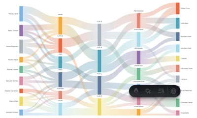
Five-Stage Pastel Gradient Sankey Diagram Generator
Use Five-Stage Pastel Gradient Sankey Diagram Generator
All GotoKit tools run directly online, no download required.
Upload a fixed CSV template to generate a five-stage Sankey diagram (source → transit → hub → channel → destination). Every node takes its own pastel color, ribbons blend a source-to-target gradient at low opacity, and slim nodes carry pill labels on the inner columns. Light / dark canvas with PNG / SVG export.
About this tool
Multi-level splits lose their middle when you only look at the ends. This Sankey chains five stages — source → transit → hub → channel → destination — into one traceable path: every node draws its own color from a pastel sequence, each ribbon blends smoothly from the source color to the target color at low opacity, and the mixing in the middle is itself a cue for how flows recombine. Nodes are 12px slim bars, and inner-column names sit on white pills above their nodes so they stay legible over the ribbons. The result reads like an infographic or poster — made for channel attribution, budget flows and supply chain stories.
- Export crisp PNG / SVG you can keep editing
- Multiple built-in themes, one-click switch
- Light and dark canvas support
- Free, no watermark, no limits
Compared with general charting workflows
| Aspect | This tool | Typical alternative |
|---|---|---|
| Visual direction | Optimized for a specific chart grammar | More general, but more setup |
| Export | Fast PNG/SVG export first | More formats, but heavier workflow |
| Best fit | Slides, landing pages, and social visuals | Building bespoke analytical charts from scratch |
Docs
What is a Five-Stage Pastel Gradient Sankey Diagram?
A five-stage pastel gradient Sankey diagram is a flow visualization that splits a complete chain into five columns of nodes — for example source → transit → hub → channel → destination. Every column sums to the same total, and each flow band is proportional in width to its value, so you can read directly how much is split off and how much is recombined at each level.
What sets this style apart is its visual language. Nodes are not heavy solid blocks but slim bars, and every node draws its own color from a pastel sequence. The bands between nodes are not flat-colored: each one blends smoothly from the source node color to the target node color and is drawn at low opacity, so multiple flows mingle naturally into layered shading in the middle of the canvas. Inner-column node names sit in white pill labels above their nodes, staying legible even on top of the ribbons. The overall palette is soft and light, giving the result the feel of an infographic or poster — ready to drop onto a report cover or an external presentation.
Features
- Template-driven auto layering: download the CSV template, fill in
source,target,valueand upload — the tool derives each node’s level automatically, so the number of columns follows your data with no manual stage declaration - Source-to-target gradient ribbons: every band computes its own gradient, blending from the source node color to the target node color at low opacity, so overlaps mix naturally and depth is easy to read
- Individual pastel color per node: even with 36 nodes, each one keeps its own color — distinct within a column, free to echo across columns — making branches far easier to tell apart than a single color ramp
- Slim nodes with pill labels: 12px bars; the first column’s labels are right-aligned to the left of their nodes, the last column’s are left-aligned to the right, and inner columns are centered above their nodes on a white pill backdrop so ribbons never obscure the text
- Three color palettes: Soft Pastel, Elegant Cool and Morandi Warm — switch with one click; dark mode lightens the palette automatically to keep contrast
- Light / dark modes: one-click background switch that is carried into the export
- Multiple export formats: high-resolution PNG (2x pixel ratio) and vector SVG, the latter editable in design software
- Privacy-first: all data is parsed and rendered locally in your browser, never uploaded to any server
Use Cases
- Supply chain & logistics: supplier → transit warehouse → distribution hub → channel → end market, showing how goods split at every level
- Budget and funding flows: total budget → department → project → spend category → final use, revealing where money is reallocated
- Channel attribution & marketing funnels: traffic source → landing page → conversion path → closing channel → customer type
- Energy and resource flows: primary energy → conversion → transmission network → consuming sector → end use, exposing losses and splits
- Recruiting and admissions funnels: application source → screening → interview → offer channel → role distribution
- Data journalism & reports: add a soft-toned, information-dense multi-stage flow chart to in-depth stories and research reports
How to Use
- Click “Download CSV template” to get the sample file (71 sample flows that render as a complete five-stage chart out of the box)
- Fill in your data following the format:
source,target,value - Click the upload area or drag & drop your CSV file onto the page
- The five-stage Sankey diagram is generated automatically; switch palettes and light / dark mode to preview
- Optionally type a heading into the “Chart title” field — leave it empty to hide the title
- Click “Download PNG” or “Download SVG” to save your chart
Data Format
| Field | Required | Description |
|---|---|---|
| source | Yes | Name of the node the flow leaves (the upstream level) |
| target | Yes | Name of the node the flow enters (the downstream level) |
| value | Yes | Numeric value of the flow (positive number); band width is proportional to it |
Limits: up to 150 data rows; at most 14 nodes per stage. The number of stages is derived automatically from the hierarchy — you never declare it in the CSV. Data must form a one-way layered structure; circular flows are reported as an error.
Note: the same name is always treated as the same node. If different stages need identical category names, prefix them per stage (for example Stage1-North and Stage3-North), otherwise they will be merged.
How to read this chart
Read the five stages left to right: first see how the leftmost nodes spread the total, then follow the ribbons to see where each level splits. Because every level is conserved, a band’s width represents both its absolute volume and its share. The pastel palette separates the branches within a level, while the gradient direction tells you where a flow comes from and where it is heading — whichever color a band fades out of is its source node. Hover a ribbon or node to check exact numbers.
About Gotokit
Gotokit is dedicated to providing simple, efficient and beautiful online tools. This five-stage pastel gradient Sankey diagram generator is powered by the ECharts rendering engine — no sign-up required, ready to use out of the box, with all data processed locally to protect your privacy.
FAQ
How many columns does the CSV need? Do I declare the stages myself?
Three fixed columns: source,target,value. You never declare stages — the tool derives each node’s column from the flow hierarchy, so the column count follows your data. Up to 150 rows and 14 nodes per stage.
Where do the ribbon colors come from?
Each node takes a color in sequence from the current palette, and every ribbon blends horizontally from its source node color to its target node color, drawn at roughly 0.32 opacity — so overlapping flows mix naturally in the middle of the canvas.
What happens if the same name appears at different stages?
Nodes sharing a name are treated as one and merged. If different stages genuinely need the same category name, prefix it per stage — for example Stage1-North and Stage3-North.
Is this chart tool better for slides, reports, or social visuals?
All three can work, but each needs a different emphasis. Slides care about legibility, reports care about structure and annotation, and social visuals care about density and style. Tune colors, labels, and export size for the destination.
When should I export PNG instead of SVG?
PNG is usually better for slides, chats, or social sharing, while SVG is better if you need to keep editing, scale for print, or embed the graphic in a design system. If the target platform does not support SVG, export a higher-resolution PNG.
How is this different from a general charting tool?
These tools are optimized for a specific visual grammar, so you can get to a strong result faster. General charting tools are more flexible across many chart families, but usually take more setup and styling work.
Can I use this tool on mobile phones or tablets?
Most tools work in modern mobile browsers, but complex charts, larger files, and precision drag-and-drop tasks usually feel better on desktop. If speed and control matter, desktop is the safer choice.
Is this tool better for one-off tasks or recurring workflows?
It is strongest for fast one-off tasks, quick verification, and temporary exports. If you need long-term automation, team collaboration, or deeper integration, you will usually pair it with desktop software, scripts, or a larger system.
More from Design
All Design toolsCircular Evidence Network Plot Generator
Generate a circular evidence network from independently entered patient totals and pairwise study counts in CSV. Node area shows patients and curve width shows studies, with local processing, light/dark mode and PNG/SVG export. No statistical analysis.
Pantone Color Picker
Pick any color and find the nearest Pantone reference instantly, with ready-to-copy HEX and RGB values for design and print workflows.
Color Wheel Studio
Explore colors with an interactive wheel, fine-tune HEX, RGB, HSL, and HSV values, and save palettes directly in your browser.
Color Scheme Generator
Generate color schemes from a base color using 7 harmony rules with live UI preview and export to HEX, Tailwind, or CSS variables.
Pantone + CMYK + RGB Print Palette
Professional print palette with 150+ Pantone swatches, 2-5 color combos, auto Pantone matching, real-time CMYK, and simulated coated-paper preview.
Gradient Art Generator
Create layered radial-gradient artwork with blend modes, random presets, and copy-ready CSS for modern backgrounds and hero sections.
Chord Diagram Generator - Free Online Circular Chart Maker
Read pair-wise relationships with a circular chord diagram: nodes ring the circle, arc length shows each node’s total flow, and ribbon width plus color encodes how strongly any two nodes connect. Made for migration, trade, calls or citations, with three color themes and PNG / SVG export.
Elegant Date Ring Bubble Chart
Map a full year of events onto a concentric date ring — months on the outer circle and days aligned inward — so each event floats as a soft gradient bubble over its own calendar cell. Sparse days and crowded holidays reveal themselves instantly in a refined, low-saturation palette with light / dark canvas and PNG / SVG export.
Dual Gradient No. 1 Nightingale Rose Chart
A Nightingale rose whose petals sweep outward in a symmetric ring, each one brushed with a two-tone gradient instead of a flat color. An optional year label sits at the center of the chart, and light / dark canvas styles come with PNG / SVG export.
Poster Two-Column Sankey Diagram Generator
A poster-grade two-column Sankey: left-side nodes take vivid colors while right-side nodes are shaded in weight-based grays, and every flow band carries its own name, value and share. The clean two-column layout is ready to drop into a poster, with light / dark canvas styles and PNG / SVG export.
Streamgraph Generator - Free Online River Chart Maker
A smooth streamgraph where every series stacks symmetrically around a baseline that sways with time, the stacked shapes undulating like shifting river channels. Ideal for comparing how the parts of a whole change together over the years; supports 2 to 16 series and 3 to 40 rows, with light / dark canvas and PNG / SVG export.
Morandi Streamgraph Generator - Free Online River Chart Maker
A streamgraph dressed in a Morandi blue-to-pink palette: low-saturation navy, blue-gray and dusty rose keep the layered river calm and easy on the eye, thin white seams separate every layer, and a top legend keys colors to series. For stacked trend views that still feel refined, with light / dark canvas and PNG / SVG export.
Error Band Chart Generator - Free Online Confidence Band Maker
A continuous error band chart: instead of a fixed shadow under the main line, a band hugs the line and changes width point by point, swelling in volatile periods and thinning in calm ones, so trend and uncertainty live in one frame. Classic off-white, rainbow and Morandi themes with light / dark canvas and PNG / SVG export.
Line Bubble Chart Generator - Free Online Log-Scale Bubble Chart Maker
A curved-stem bubble chart for timelines: each event sits on a year axis, a thin stem bows rightward off the bottom spine and lifts a translucent bubble, and a logarithmic Y axis keeps values across orders of magnitude (0.7 to 14) comparable in one frame while bubble size maps by square root. Five category colors, light / dark canvas and PNG / SVG export.
Morph Bubble Zoning Diagram Generator - Free Online Organic Bubble Diagram Maker
A Morph Bubble Zoning Diagram where child nodes fuse into their hub with Metaball surfaces instead of floating detached, labels run along each node’s outer arc, dashed links connect the bubbles, and a teal-to-green four-color palette keeps the cluster calm. Made for hub-and-member structures; light / dark canvas and PNG / SVG export included.
Scallop Chord Diagram Generator - Free Online Bipartite Chord Diagram Maker
A scallop-shaped bipartite chord diagram: group arcs along the bottom are weighted by total flow into unequal scallops, target nodes fan across the top in equal-width arcs, and the flows between them become thin ribbons bending along center-crossing Bézier curves, with radial labels that never tangle. Built for few-groups-to-many-targets bipartite data; light / dark canvas and PNG / SVG export.
Annotated Heatmap Generator - Free Online Table Heatmap Maker
A table heatmap that keeps the numbers legible: every cell is both color-filled and labeled with its value, a diverging scale stretches from zero toward positive and negative extremes, and a vertical ticked color bar sits on the right. Themes for classic, rainbow and Morandi looks, light / dark canvas, PNG / SVG export.
Grouped Bar Chart with Error Bars Generator - Free Online Chart Maker
A grouped bar chart with error bars in the restrained academic style: two pastel-colored bars side by side, black I-shaped error bars on top, a full black axis frame and x labels rotated 45 degrees — a faithful reproduction of a paper-ready figure. Built for experimental group comparisons, with light / dark canvas and PNG / SVG export.
Ridgeline Plot Generator - Free Online Joy Plot Chart Maker
A ridgeline (joy) plot that stacks several distributions along their own horizontal baselines, peaks rising smooth and never overlapping, with a series name on the left of each row and a dot legend beneath — ideal for comparing the peaks and spread of many groups side by side. Up to 6 series and 400 rows, with light / dark canvas and PNG / SVG export.
Radial Stacked Bar Chart Generator - Free Online Circular Bar Plot Maker
A radial stacked bar chart (racetrack / circular bar plot) where each row of data becomes one concentric ring, split into stacked category arcs whose lengths stay proportional to the ring total — like laps of a track labelling each year’s composition. An italic total sits just beyond every arc end and a vertical square-marker legend keys the colors; light / dark canvas and PNG / SVG export included.
Energy Flow Sankey Diagram Generator
A free-depth energy flow Sankey that renders energy sources → conversion carriers → end uses in one chart, in UK DECC style. Every node takes an earthy multi-hue color, ribbons blend a source-to-target gradient at ~0.2 low opacity, and all node labels sit to the right of their bars with no background. Three palettes, light / dark canvas and PNG / SVG export.
Metabolite–Pathway Enrichment Sankey Generator
Render a two-column metabolite → pathway enrichment Sankey plus a matching right bubble panel in one chart. Ribbons use one flat light-gray tone at ~0.6 opacity so overlaps darken; every label sits to the left of its bar, right-aligned and vertically centered with no pill; ~50 pastel metabolites feed 11 gem-toned pathways; the bubble panel aligns row-by-row, x = -Log(Pvalue), area = Count, red shade = Hit Ratio. Light / dark canvas and PNG / SVG export.
Four-Stage Decision Sankey Diagram Generator
A four-column Sankey that renders the whole funnel at once — origin, destination, decision, then breakdown by origin. Volume layers in from the left, the right side splits it into accepted-versus-rejected comparison bars per source, and a year badge plus three palettes complete the academic poster look for review, approval or admission flows.
Triangular Distribution Matrix Heatmap Generator
Lay out a frequency matrix — how many days each category spends in every value bin — as a stepped triangular heatmap. Cell color encodes frequency while IQR ranges, median dots and mean crosses are drawn automatically, revealing skew and spread at a glance. Three palettes, light / dark canvas and PNG / SVG export.
Circos Gradient Ribbon Chord Diagram Generator
A Circos-style chord diagram split into warm and cold camps: warm nodes and cold nodes each form a continuous arc, and the link between them becomes a ribbon that gradients from one end’s color to the other’s. Whole-camp flows are legible at a glance for matrices such as genomics, networks or ecology; dark mode and PNG / SVG export included.
Bubble Chord Diagram Generator - Circular Collaboration Network
A bubble chord diagram places paired relationships around one big circle: each node is a bubble whose size shows the node scale and whose fill walks an aqua-to-blue colormap for strength; links bow toward the center with thickness proportional to the flow value, while node names radiate outside the ring. Built for collaboration networks, supply-chain dependencies and inter-team flows where each node also carries metrics, still legible around 30 nodes; dark mode and PNG / SVG export.
Radial Arc Flow Diagram Generator
A radial arc flow diagram for country-to-organization flows: a top arch is segmented by region with country ticks along the arc, and curves stream down from each tick into organization nodes sized by total volume. Built for global trade, aid or migration narratives, with dark mode and PNG / SVG export.
Two-Tone Ring Chord Diagram Generator - Bipartite Flow Chart
A two-tone ring chord diagram for bipartite source-to-target flows: a slate top half-ring holds sources and a pink bottom half-ring holds targets, each node an arc sector weighted by its total flow; bezier curves cross the open center toward arrowheads on the target side. Built for threat modeling, capability mapping and requirements traceability; dark mode and PNG / SVG export.
Double Fan Colorful Chord Diagram Generator
A double-fan colorful chord diagram turns bipartite flows into an hourglass: five solid-colored arcs fan across the top and five pastel arcs fan across the bottom along one circle, with open gaps at 3 and 9 o’clock. Translucent colored ribbons cross the center waist, and every sector carries its own tick axis starting at 0 with majors every 10 units. Built for channel flows, cost allocation and requirement coverage; dark mode and PNG / SVG export.
Circos Collinearity Chord Diagram
A Circos collinearity chord diagram treats ring segments as continuous coordinate tracks instead of discrete nodes: outer ticks show positions and thin curves in the center map one interval to another. Built for genome synteny, block migration, address-range remapping, batch reassignment and stratigraphic comparison, with light/dark mode and PNG / SVG export.
Group Flow Chord Diagram Generator
Draws “many sources into a few groups” as one ring: the left half holds small source arcs in a single purple, the right half holds group arcs one colour each with a matching vertical legend, arc width equals node totals, and ribbons are tinted by their target group. White dividers inside group arcs show at a glance how many sources feed each one. Built for sample classification, channel attribution, topic assignment and batch destinations, with dark mode and PNG / SVG export.
Spectral Ring Chord Diagram Generator
Turns a pairwise relationship matrix into a spectral ring: nodes run clockwise from the largest total to the smallest, arc colors are sampled along one continuous ramp so hue is the ranking itself (reddest biggest, bluest smallest), every relationship is a uniform thin teal line bending toward the centre, and white dividers inside an arc are that node’s connection list. Dark mode and PNG / SVG export included.
Arc Diagram Generator
A classic arc diagram that flattens co-occurrence onto one baseline: colored group ticks sit on the line, vertical group-colored labels stand at the left, and relationship strength is drawn as semi-transparent semicircle arcs whose height and thickness vary with the weight — clean even at 400 relations. Great for timelines and ranked pairings; dark mode and PNG / SVG export.
Grouped-Color Rose Chart Generator
Turn category, value and group columns into a Nightingale rose where every petal takes the color of its group, hues flowing smoothly from one segment to the next. Includes a label toggle, light / dark canvas styles and PNG / SVG export, all rendered locally.
Excalidraw Whiteboard
Use a hand-drawn online whiteboard for flowcharts, sketches, wireframes, and annotations with local editing and export.